
JPEG Optimisation Guide for Web Designers
Image compression in all native media formats and how the data is compressed and shown on screens differs between GIF, PNG, and JPEG formats. Finding the right balance between file sizes and screen representation is critical, and there is more than one fixed solution for designers.
Understanding JPEG compression requires some initial experience, but it becomes much simpler with practice. In this article, let us discuss how web designers can create creative visual media for online users. Optimising photographs to reduce page load times without sacrificing acceptable quality would be preferable.
Optimising JPEG Image Quality and File Size
When saving JPEG images, it’s essential to consider the balance between image quality and file size. Contrary to what some might think, saving a JPEG at 100% quality only sometimes yields the best results in terms of optimisation.
This is because the 100% setting prioritises maximum quality, often leading to unnecessarily large file sizes without a proportional increase in visible quality. A more efficient approach is to save JPEGs at slightly lower qualities, such as 90% or 95%.
These settings typically produce visually indistinguishable images from their 100% quality counterparts but with significantly reduced file sizes. It is often possible to go below 90% quality without compromising the image’s visual integrity.
This is particularly useful for web purposes, where loading times and bandwidth usage are critical considerations. Adobe Photoshop’s ‘Save for Web’ dialogue provides preset values and a preview feature to help you make informed decisions about the trade-off between quality and file size.
This tool allows users to visually compare the impact of different quality settings and choose the most appropriate one for their needs. Remember, the key is to find the sweet spot where the quality is good enough for the intended use and the file size is as small as possible.
- Low – 10%.
- Medium – 30%.
- High – 60%.
- Very High – 80%.
- Maximum – 100%.
In Adobe Photoshop, 60% of an image’s quality is regarded as “high.” Many web developers agree that a safe range to stick with is between 50% and 70%.
JPEG Compression Settings for Project-Specific Optimization
Selecting the right JPEG compression settings should be tailored to the project’s specific needs. Prioritise images that naturally have larger file sizes, as these will benefit most from compression.
However, be cautious when compressing too much; reducing the quality below 30% often leads to degradation in visual quality. To find the ideal balance, consider setting a threshold, such as 50%, as the lower limit for quality.
This approach helps maintain a reasonable clarity level while still reducing file size. The key is experimenting with different settings to see which offers the best compromise between image quality and file size for the project’s visual requirements.
Remember, each image is unique, and what works for one might not be ideal for another. Adjustments should be made on a case-by-case basis, considering the overall design and the purpose of the image. Regular experimentation with these settings will help better understand how different compression levels affect image quality and file size, enabling more informed decisions for future projects.
Balancing Quality and File Size
When discussing JPEG compression, it’s essential to clarify the relationship between ‘compression’ and ‘quality,’ as these terms are inversely related. In JPEG terms, if an image is saved with 40% compression, it implies that the quality is set to 60%.
The maximum quality of 100% corresponds to no compression, offering the best image quality and the largest file size. For most users, especially when saving images for web use, simple methods of adjusting quality and compression levels are usually sufficient.
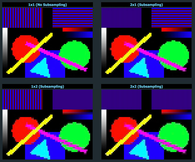
However, when considering colour space transformations, things get more intricate, such as converting RGB (Red, Green, Blue) images into the YCbCr format (Luminance, Chroma Blue, Chroma Red). In JPEG compression, luminance, or the image’s brightness level, is always prioritised and maintained at the highest possible quality.
This is because the human eye is more sensitive to changes in brightness than to changes in colour. The YCbCr format helps optimise the compression process by separating the brightness from the colour information.
This leads us to ‘chroma subsampling,’ a technique where the colour information (Chroma Blue and Chroma Red) is compressed more than the brightness. Chroma subsampling is an effective way to reduce file size while maintaining a high perceived image quality.
Take note that Adobe Photoshop does not always apply chroma subsampling when compressing JPEGs. In the ‘Save for Web’ tool, chroma subsampling is only used if the quality setting is below 50%. This distinction is crucial for understanding how different settings in Photoshop affect the final output of the JPEG images.
Differentiating Image Types for Web Optimization
The web is a diverse landscape of image media, each serving a unique purpose. This diversity includes photographs, icons, buttons, badges, and other visuals. It’s essential to recognise that each type of image requires a different optimisation approach.
For instance, the quality standards you apply to a photograph should differ from those for a simple button or icon. When dealing with photos or detailed illustrations, consider using a dual-image strategy.
This involves connecting to a high-quality, less-compressed JPEG version for main viewing while using thumbnails with a higher compression ratio and significantly smaller file sizes on a website. Thumbnails are placeholders that load quickly, offering a preview while the full-quality image loads in the background.
This approach, however, comes with a trade-off: it is required to maintain two sets of images in the media gallery – one for high-quality viewing and another for thumbnails. This can increase the management workload but is often worth it for the improved user experience and faster page load times.
It’s also essential to evaluate the overall visual content of the website and consider how each element can be optimised individually. This tailored approach ensures that each image type is optimised for its specific role, balancing quality and performance to create a seamless web experience.
Optimising for Easy Access and Fast Loading
Organise image files to facilitate easy browsing for a more efficient and user-friendly web experience. One strategy is to utilise a Content Delivery Network (CDN) or a cloud storage service like Amazon S3.
These platforms can significantly speed up the delivery of images to website visitors by storing the images on servers that are geographically closer to each user. In addition to strategic storage, it’s crucial to focus on reducing the file size of the images without compromising their quality.
This involves using image compression tools, which help minimise the number of bytes in each image file. Smaller file sizes lead to faster loading times, essential for keeping a website responsive and engaging. When selecting tools for image compression, there are several options available. Here are a few tools to consider:
Efficient Image Compression with TinyJPG
TinyJPG is a user-friendly, browser-based tool designed to optimise JPEG images by removing unnecessary data, thereby reducing file size. Contrary to some compression methods that can degrade image quality, TinyJPG’s process is lossless, meaning your images’ visual quality remains intact.
The tool allows for the convenient uploading of multiple images, supporting up to 20 photos at a time, with each photograph having a maximum size of 5 MB. This makes it ideal for batch processing, saving time and effort for users dealing with numerous images.
For WordPress users, TinyJPG extends its functionality through an official plugin called ‘Compress JPEG & PNG images.’ This plugin integrates seamlessly with WordPress, automating the optimisation process for images uploaded to THE website. Additionally, the plugin connects to TinyPNG, a sister service of TinyJPG, which specialises in optimising PNG images.
Using TinyJPG and its WordPress plugin, CMS web developers can easily manage and optimise images directly from browsers or within WordPress sites. This enhances website performance by reducing image file sizes and maintains high visual quality, ensuring a balance between efficiency and aesthetics.
Batch Image Optimization with IrfanView and RIOT Plugin
IrfanView is a free program for Windows and a powerful tool for viewing and optimising large photograph collections. Its appeal lies in its ability to perform batch conversions, a feature particularly useful when dealing with images from multiple directories.
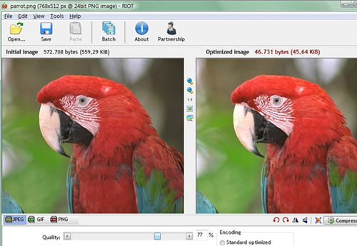
This functionality automatically allows users to apply the same optimisation operations to hundreds of JPEG images, streamlining the process significantly. Enhancing IrfanView’s capabilities is its support for third-party plugins, the RIOT (Radical Image Optimization Tool).
RIOT enhances IrfanView by providing advanced image optimisation options. This plugin is also compatible with other open-source graphic editors like GIMP, broadening its applicability. One of the features of RIOT is its dual-image view, which enables users to adjust compression parameters for each image manually.
This interface allows for a direct comparison between the original and optimised versions, facilitating fine-tuning compression settings. In addition to its straightforward user interface, RIOT can strip away extra metadata from images during compression.
This includes data like Adobe XMP and EXIF, which, while occasionally useful, often contribute to unnecessary file size bloat. Removing this metadata can significantly reduce overall file size, making RIOT an excellent choice for optimising images without sacrificing essential data.
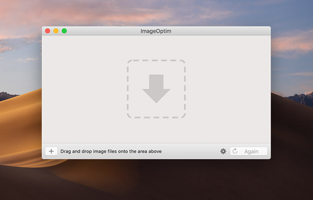
Optimising Web Images Efficiently on OS X with ImageOptim
For users on OS X seeking a powerful yet user-friendly tool for web image compression, ImageOptim emerges as a standout choice. Its performance often surpasses even that of professional-grade software like Photoshop, especially in web-focused image optimisation.
ImageOptim is designed with a focus on simplicity and efficiency. It features full drag-and-drop support, which greatly simplifies optimising large collections of images. Users can effortlessly drag their image files or folders into the application, and ImageOptim will handle the rest, streamlining what can otherwise be a time-consuming task.
In addition to its intuitive graphical interface, ImageOptim offers advanced functionality for more technical users. It allows for the creation and execution of shell scripts, providing an option to optimise images directly from the Terminal. This feature is handy for those who prefer script-based workflows or need to integrate image optimisation into larger automated processes.
The ease of use and advanced capabilities make ImageOptim an ideal choice for a wide range of users on OS X, from casual bloggers to professional web developers. Whether for individual use or as part of a larger workflow, ImageOptim delivers efficient and effective image compression tailored to the needs of web content.
Conclusion
Despite the advent of faster internet connections with technologies like 4G and the emerging 5G, the need for speed optimisation in website design remains a priority. It’s important to understand that unoptimised content can hinder website performance even with faster internet speeds.
This is particularly true for image-heavy websites, where large file sizes can significantly slow loading times. Moreover, speed optimisation plays a vital role in Search Engine Optimization (SEO). Search engines often favour faster-loading websites, as they provide a better user experience.
The challenge of compressing images, once a significant hurdle for web designers, has been dramatically simplified by introducing new, user-friendly tools. These tools enable designers to efficiently compress images without sacrificing their visual appeal.
As a result, web designers and developers can now create visually stunning media that is both high in quality and optimised for quick loading. At ARCC, we focus on design solutions that strengthen brand communication and appeal, targeting effective engagement with corporate clients. Feel free to contact us to find out more.